Also although at first glance it seems like this would be a five minute job to make, I have a feeling that down the line (3 years or so), this will seem a lot more iconic.
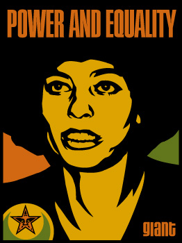
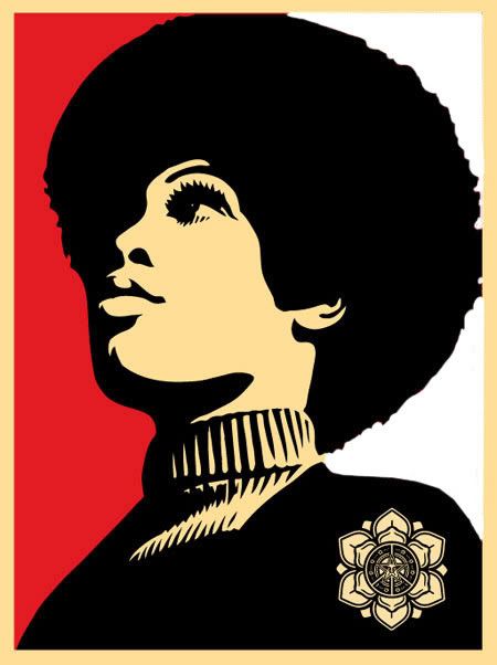
but i just don't understand why shepard keeps clipping off the tops of people's heads. either crop it more or leave some space between the top of the head and the edge of the print.
i also have an uneasy feeling that we'll see another colorway next week.
I'm guessing the purpose of the clip/crop of the top of the heads in recent designs is to break up the design into sections, so design wise you wouldn't have to deal with the Yen Pattern transitioning into the solid red.
trkr2007 wrote:so will someone let us know if this print is going to drop i need to get a haircut.....
robotoil wrote:I like to fish for Bass while I'm drinking a Bass.
vs.
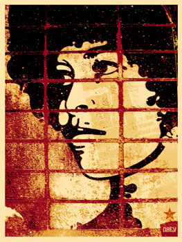
Me likey old style better.
Personally I like the direction he is going on this, its still as simplistic and I think it speaks much louder without copy on it and helps the image stand out more.
I am very happy that he didn't try and put any pattern in the face.
random message board post about art wrote:
This past weekend I briefly visited a room that had three faithful reproductions of Duchamp's Fountain. Not only did I notice, I used one of them. It's so interesting because the work tells the truth.
itsniceouthtere wrote:yeah because we all know how intricate and deep the meaning within street art can be. If anything, street art is the MOST LITERAL FORM OF ART! if street art has made any negative impression on society today, its that it has made every 13 yr old with $100 and an eBay account into an art know-it-all.
Jason Filipow wrote: "MBW was that last bit of dead weight that broke the rear axle of the street art bandwagon."
destroyeric wrote:I'm guessing the purpose of the clip/crop of the top of the heads in recent designs is to break up the design into sections, so design wise you wouldn't have to deal with the Yen Pattern transitioning into the solid red.
i think this assumption is spot-on.
i'm proud to be the shepherd of this herd of sharks.
Backpackpunk wrote:Personally I like the direction he is going on this, its still as simplistic and I think it speaks much louder without copy on it and helps the image stand out more.
Same here, and that's coming from a copywriter. I prefer the new image to the old one. The thing the old one has going for it is the orange/green and the fact it's, well, old.
"I'm a drinker with a writing problem." -- Brendan Behan
destroyeric wrote:I'm guessing the purpose of the clip/crop of the top of the heads in recent designs is to break up the design into sections, so design wise you wouldn't have to deal with the Yen Pattern transitioning into the solid red.
i completely understand why he is doing it but i think the way he is doing it is very distracting. he should either crop it more or leave some space and work the background pattern a bit differently.